 Our thanks to Carol Chiao for this second in a series of posts to provide perspective on the business of writing, leveraging a marketing professional’s experience.
In the last DIYMBA article, we defined brand as an author’s promise to readers. Design is the visual manifestation of that promise.
In the crowded space of a bookstore, real or digital, a book may only have seconds to break through to a reader. Good book cover design can achieve break through. Mediocre design can get lost.
This challenge is akin to a packaged good trying to grab attention in a grocery store filled with hundreds of thousands of products. So, what can we learn from packaging design principles?
 First, consistency of key elements across a range of books allows readers to recognize a series or author they like. Brand marketers understand the power of consistency. Coca-Cola has protected key elements of its logo design for decades, to ensure easy recognition within a split second. Check that idea by taking a look at the partial logos at left. How many do you instantly recognize?
For a book cover, consistency can come in the form of the font (of the author’s name or book title), the use of color, the feeling or tonality of the imagery, or the placement of key elements.
Jojo Moyes’ books have achieved an instantly recognizable look. They use distinctive fonts in boldly contrasting colors that dominate the entire book face:
 In a well-known case study, Tropicana moved away from its famous image of a fresh orange with a red and white straw to a generic image of a glass of juice. Sales dropped 20% in six weeks. The manufacturer returned to the original imagery. This is a strong example of the importance of consistently using well-established design elements.
 Note, too, that the original image was well-designed. An orange with a straw is a great short-hand for fresh squeezed juice.
How do we identify those well-designed elements for our own covers?
If you’re going to be working directly with a designer (for instance, if you’re self publishing), start by clarifying objectives of the design. What are you trying to achieve in the design? Document that in a brief. Here’s a sample brief showing some of the elements to consider: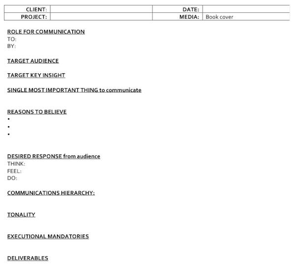
- Stay single-minded in your brief. The “Single Most Important Thing to Communicate” should be the one message that is most impactful to communicate in the book design. It could be the critical tension or premise of the book. If the word “and” appears in your articulation of the one message, that’s actually multiple messages.
- When completing the brief, aim to inspire and inform the designer with evocative yet precise language. For all you writers, this part should be fun. Anabelle Bryant, in a brief for one of her book covers, didn’t describe her heroine as a blond but with hair the color of “freshly baked scones.”
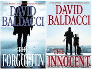 Prioritize communications objectives. In the communications hierarchy, describe what you want the reader to notice first, second, and third. For well-known authors, their name may be the first order of communication. Take a look at the placement and size of David Baldacci’s name on his books. For lesser known authors, it may be more important for the story’s hook be the first order of communications.
- Minimize mandatories. Give the designer leeway to explore achieving the communications objective through multiple means. Don’t fall into the trap of being too prescriptive. Designers may think of avenues that you haven’t even considered. Anyone who tells a designer that the cover must contain “a quilt, a blond heroine kissing a dark-haired hero, a castle in the background and a stormy sky,” will get placement of elements rather than the designer’s true expertise.
- Consider the longevity of the design. If this is the first in a series, work with the designer to identify which elements will stay consistent across the range and which will change. This consideration is even more important if it’s the first book for an author, as it sets the canvas for future works.
To recap, design is a visual manifestation of your author brand. To break through, design needs to be consistent across a range of books and over time, as well as distinctive to your brand. Clarify the design’s objectives into a creative brief and stay single-minded in your communication. In the next article, I’ll cover how to assess designs against the brief.
I’d love to hear from you. Let me know what other concepts you’d like covered in DIYMBA. Contact me at twitter @c_vandenhende or Facebook: facebook.com/carolvandenhende.
Sources:
Ad Age article “Tropicana Line’s Sales Plunge 20% Post-Rebranding” by Natalie Zmuda April 2, 2009
http://adage.com/article/news/tropicana-line-s-sales-plunge-20-post-rebranding/135735/
 As a marketing executive for a top 20 consumer goods company, Carol Van Den Hende has led the positioning, branding, strategy, design and product development for billion dollar brands. For more than 15 years, she’s collaborated with best-in-class advertising and promotions agencies.
Recently, Carol has been teaching authors to apply marketing techniques to branding and design. Carol is completing her debut novel titled “Missing Pieces.” Inspired by combat-wounded veterans, Carol has crafted a love story centered on transformational challenges.
Carol earned an undergraduate degree in Industrial Engineering from Rutgers, and an MBA from Lehigh University. She is an avid member of RWA, NJRW, Mensa and Women Who Write. Carol has lived in the U.S. and China with her husband and twin boys. Connect with Carol at Twitter: @c_vandenhende or Facebook: facebook.com/carolvandenhende

Lightsinger, an exciting part of the process! How’s it going? Part II on assessing design options is on its way!
Thank you for posting this article on cover design. It’s where I am in my publishing process.
Wonderful – we’ll be running part 2 in the next week – watch for it!