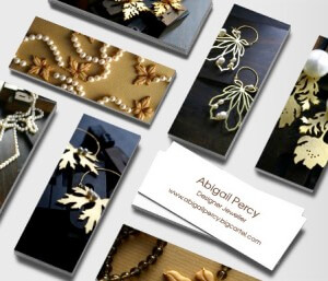
 Ah, remember the days of calling cards? Those elegant slips of fine paper that announced a visitor, adorned only with a gentleman’s name… later his address… and later still, well, everything but his shoe size. Of course you don’t remember, unless you’ve seen it in the movies. But there is a whole fascinating history to the calling card, explained in this great article, The Gentleman’s Guide to the Calling Card.
A calling card was more than just a hasty exchange of emails and phone numbers; each card made a distinct statement about the caller:
To the unrefined or unbred, the visiting card is but a trifling and insignificant bit of paper; but to the cultured disciple of social law, it conveys a subtle and unmistakable intelligence. Its texture, style of engraving, and even the hour of leaving it combine to place the stranger, whose name it bears, in a pleasant or a disagreeable attitude even before his manners, conversation, and face have been able to explain his social position. – Our Deportment
 Nowadays there exist remnants of this theory: A man or woman can lead with their business card, make a statement about themselves and/or their work. And what have morphed into business cards have become so much more, too. Much like today’s marketing-packed bookmarks, business cards lead folks to our websites, even tell people about our promotions, like the one on the left we used at some recent book events to share info about our new Winner Circle.
At one of those events, the Atlanta Writers Conference, I ran into a card whose idea was simple, yet truly elegant, using a “Moo card.” If you haven’t seen one of those yet, they’re the half-sized cards pictured above and becoming more and more popular, especially among the artsy set, as a lighter, easier-going card. Visit the us.moo.com website and you’ll see plenty of fascinating examples. A tiny burst of color and minimal use of words make these calling cards new, unique, and thus more interesting.
In this aspiring aspiring author’s case, the front side of the moo-card featured only the name of the writer, and underneath, her website. And on the backside… the logline of her book. POW! Lots of impact in the tiniest of spaces.
And really, how clever: a living, breathing “elevator pitch” distilled down to its most important words, and placed right on a business card, but without a ton of words or an over-the-top marketing message. It was an easy message she could pass out to the attending agents, editors and other authors attending. A memorable one as well, as agents at our faculty lunch also made mention of this writer’s creative approach.
Do you have a clever calling card that announces you and your work? Share it with us by email to info@writerswin.com. If we gather several interesting cards we’ll do a follow-up feature to show you off and share the creative sparks…
Have an interesting way you’ve used your card to attract interest or business? Share it in the comments below!
 Creator of Where Writers Win, Shari Stauch has been involved in publishing, marketing and PR for 30 years. She is also the principal author of the WWW blog, and speaks at conferences around the country. The Where Writers Win team’s newest collaboration is The Winner Circle – vetted book review directories, book clubs and other cultivated resources for emerging authors. (Graphic courtesy FreeDigitalPhotos.net)

Since I write mainly in futuristic and sci-fi genre my cards feature the Hale-Bopp comet over a stone arch. It’s sort of generic but gets the point across–I hope, lol!
Sounds cool! What info do you include?
I just ordered from Moo business card and post cards. Love all the designs they feature. Great prices also, Check out my fan page I will be showing them as soon as possible.
Fabulous, Beverly – can’t wait to see what you picked!
As you know, I currently have two business cards. My author business card showcases the banner art of my website with only my website address and book genre. Perhaps I should add an email address line on the next order. My other card has morphed into a two-sided vertical card since my second novel was released. Each side shows an image of the eBook cover art and in the 1/2″ white space at the bottom – on one side is the opening hook of that novel and my website address, while the reverse side has genre and where the novels can be purchased. Potential readers seem to really like having the image of the book cover(s) to verify they are purchasing the correct book(s).
Agreed, Lynne – if you have a book, must show off that cover! Continued success 🙂
I use my business card as an ID that slides in a clear pocket on top of my change purse I use for my “Bridge” money. I leave it laying on top of the table while I am playing bridge and have had lots of comments.
Clever, clever!